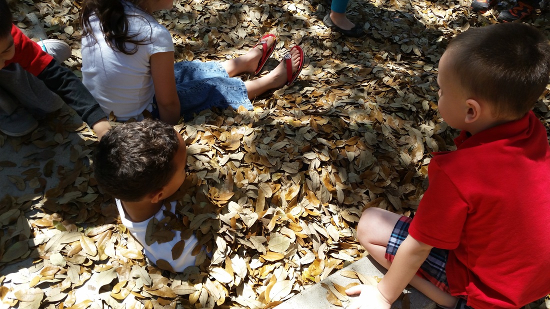
Playing in the leaves isn't just for the Fall! Happy Spring!
| Mrs. Garcia's Pre-Kindergarten Class |
The Home for all our Pre-K fun!
|
|
Playing in the leaves isn't just for the Fall! Happy Spring!
0 Comments
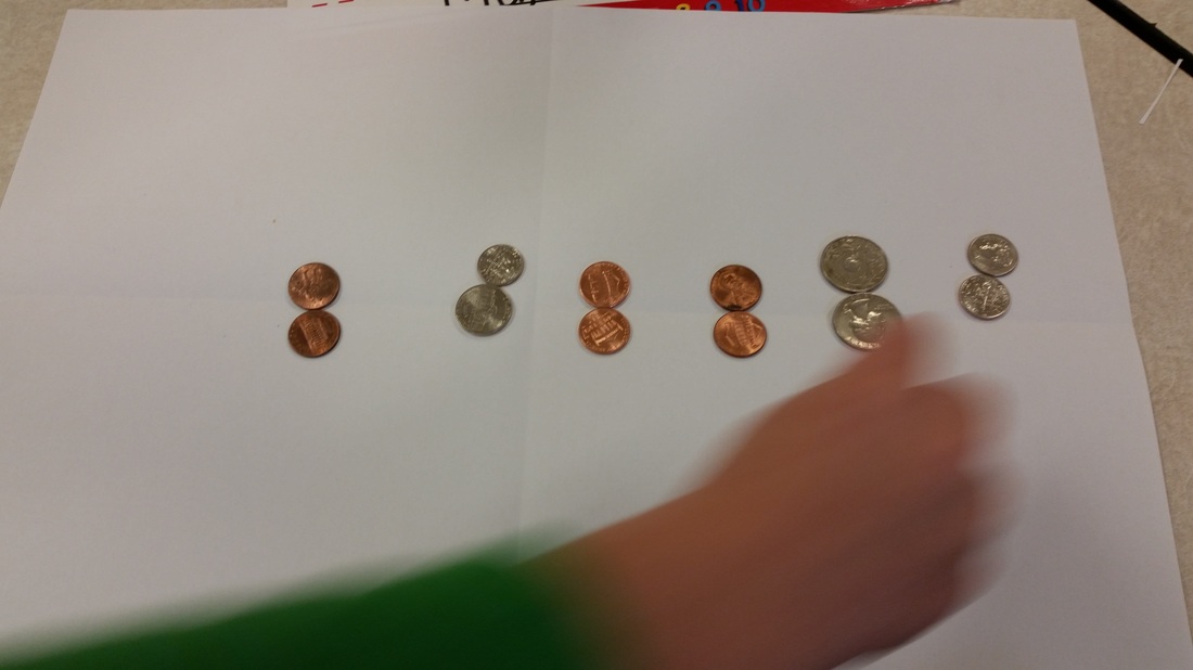
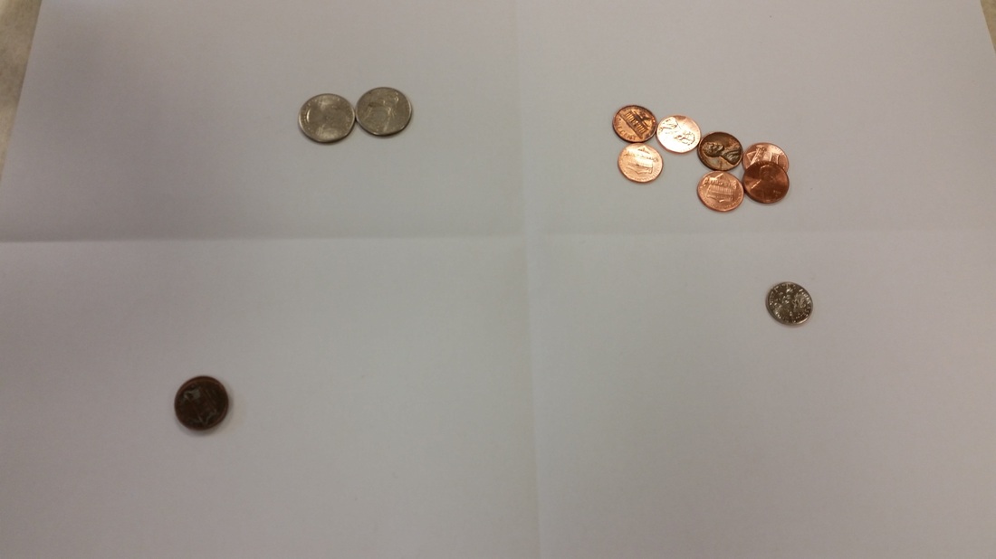
As we continue exploring graphs and the students realized that we have new students in the class this spring that did not make a shoe graph with the class at the beginning of the year, so we recreated our graph. As we re-graphed our shoes, we realized that our data had changed since the beginning of the year. Most of us were not wearing the same shoes we wore at the beginning of the year! Another thing we recognized about our graph was that if we change the way our shoes are sorted/grouped, then the answers to our data questions are different. Which shoe has the most? Tie shoes (see below). Which shoe has the least? Sandals New group - Tie&Velcro, our most shoe changed to Velcro! Amazing Data analysis! 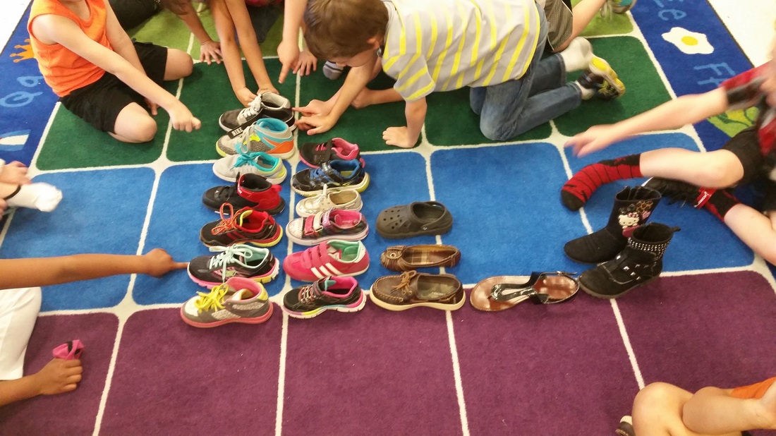 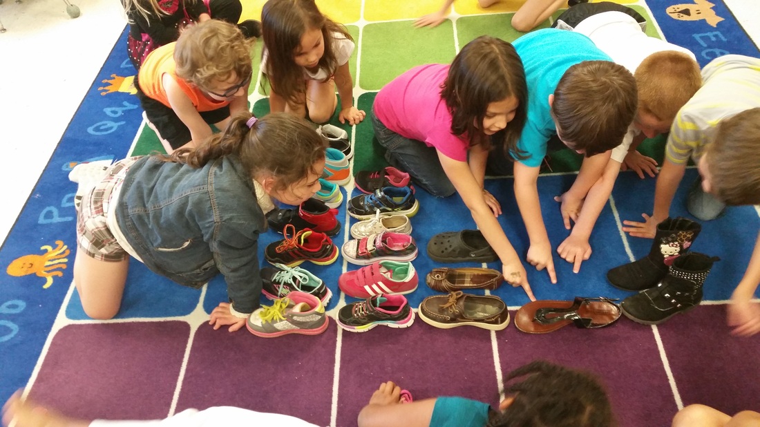 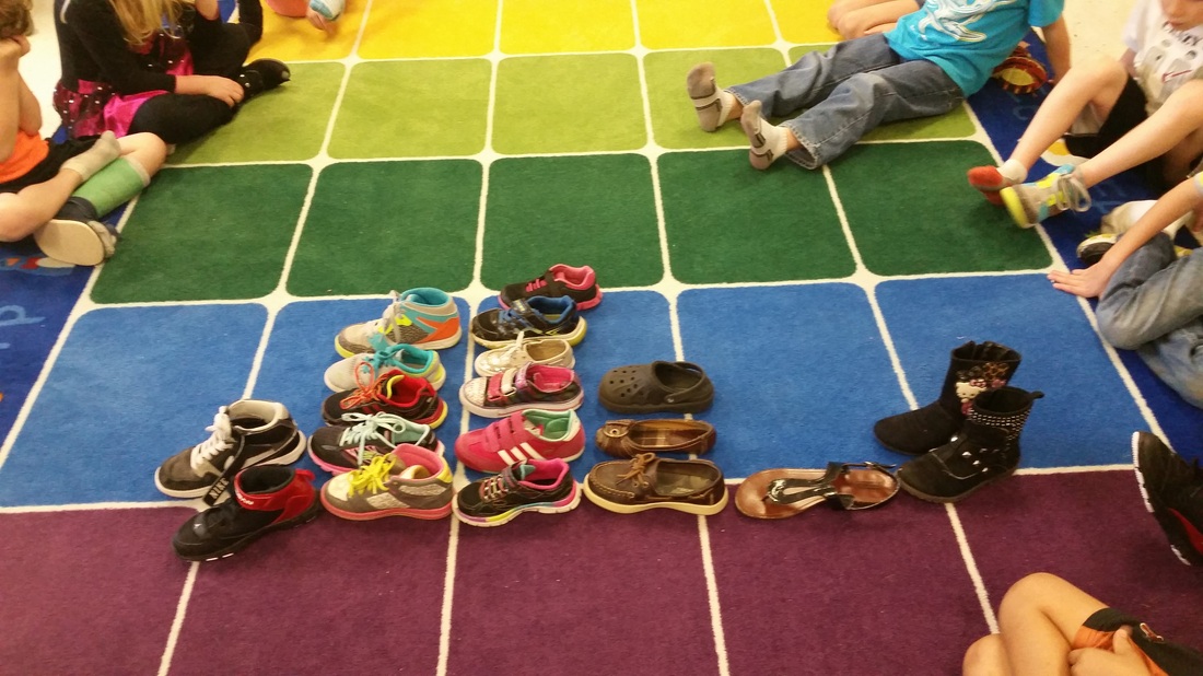 The students explored and sorted coins by their properties. Check out a few of their sorts! 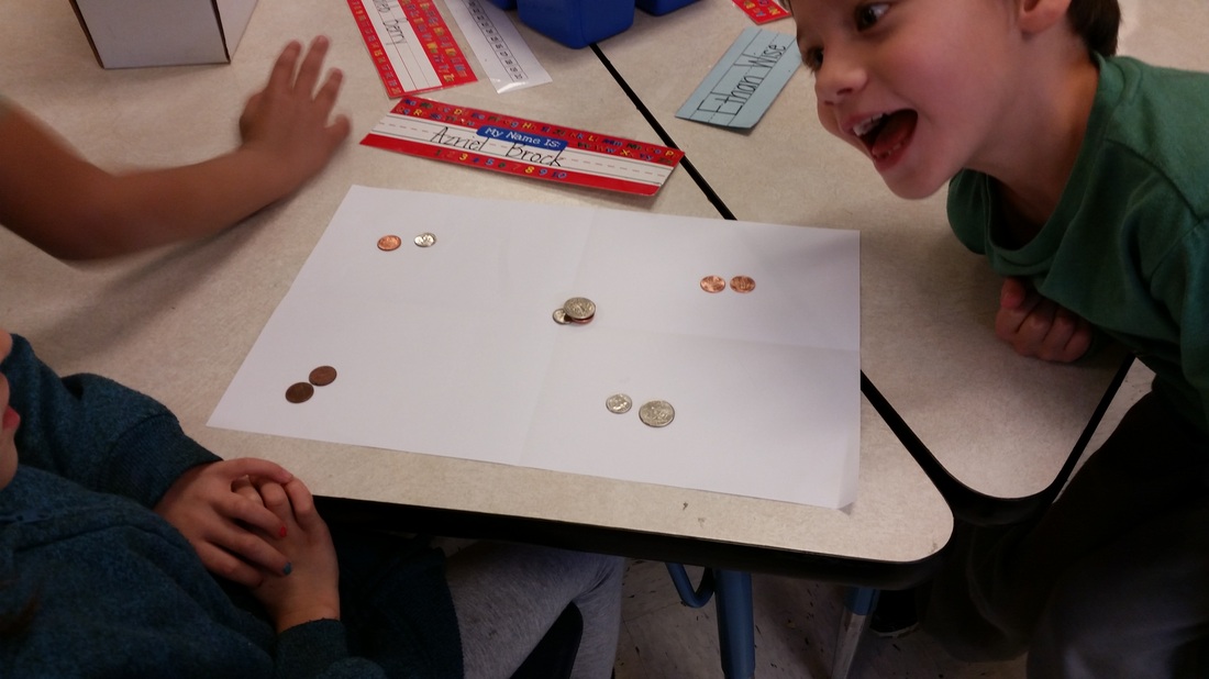
|
Mrs. GarciaIt's me! Hope you enjoy our shares. Archives
January 2017
Categories |
 RSS Feed
